Why Is Siri Watch Face On Apple Watch So Dumb?
Apple Watch is continually getting smarter, especially around fitness and activity, but it’s still got a long way to go. Trying out the new Siri watch face has showed that more than anything.
Looking at the bigger picture for a second, the first question around Apple Watch’s smartness is why aren’t the watch faces more dynamic? I find myself wishing complications would change to other ones when they are no longer relevant. For example, if you have a calendar complication on a modular face and your appointments are done for the day, shouldn’t it switch to another complication for the rest of the night instead of being empty space?
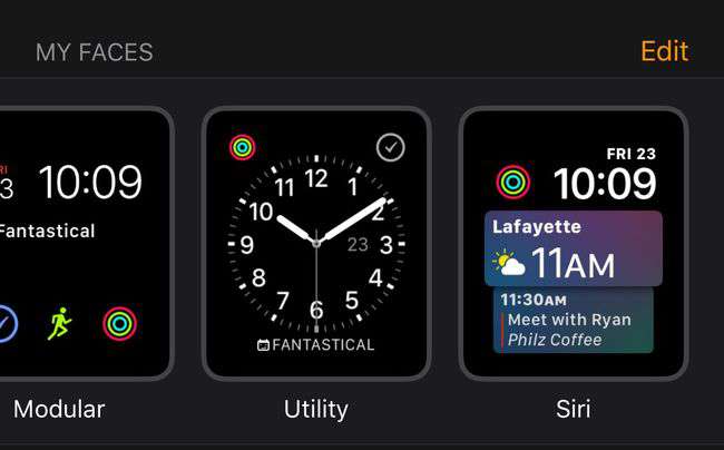
We may not have dynamic complications presently, but in the meantime we have the Siri watch face which I hoped would be a move in that direction.
In the first week, waiting for it to be useful, it has seemed to just fall completely flat.
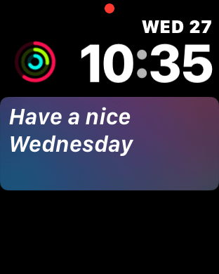
Even with appointments on the calendar showing for tomorrow when I scroll the crown, the watch face only shows “Have a nice Wednesday.” It’s frustrating that the Siri watch face isn’t eagerly trying to push as much information to the user as possible.
For the first few days all I saw on the main face was stocks and News, but never at the same time—there was always space open on the face.
I have HomeKit items setup, I’ve had tickets for immediate use in my wallet, calendar items, and other active items that never once showed on the main watch face. To try and prompt those more, I turned off News, stocks, and Breathe and still didn’t see much change.
In my opinion, the screen should never be blank. There’s always plenty of information that can be displayed, including weather. The potential even for a mediocre proactive experience is here and in place and yet the Siri watch face swings and whiffs.
Is this a common experience for everyone? “Hey Siri, why aren’t you paying attention?!”
Maybe watchOS 5 can bring some true dynamic complications, or at least revamp the Siri face.


